Thirst.io
Development / Design

Overview
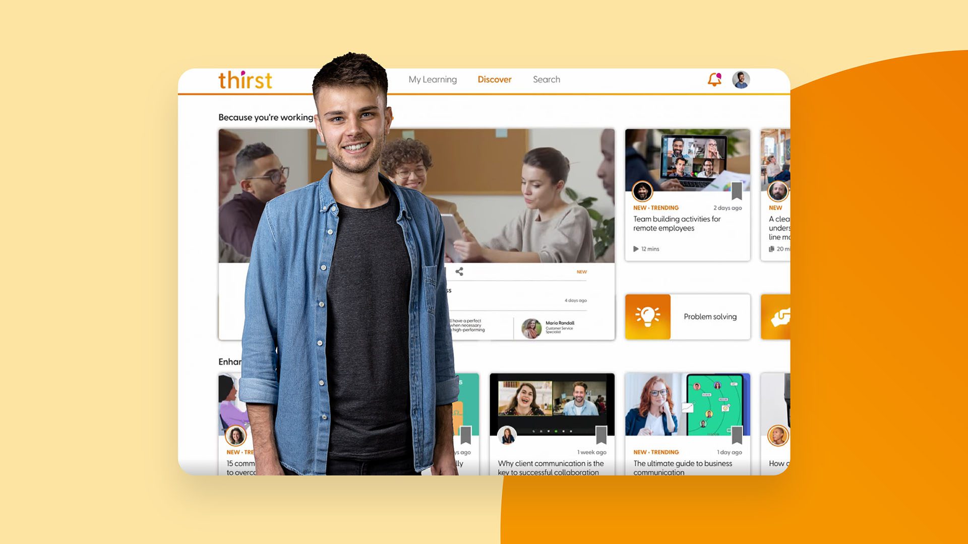
Thirst helps businesses to build a culture of growth by putting relevant learning content front and centre for it’s users, exactly when they need it the most. Thirst approached Snap to help progress it’s online brand and develop out a greater range of graphic design styles.


Our strategy
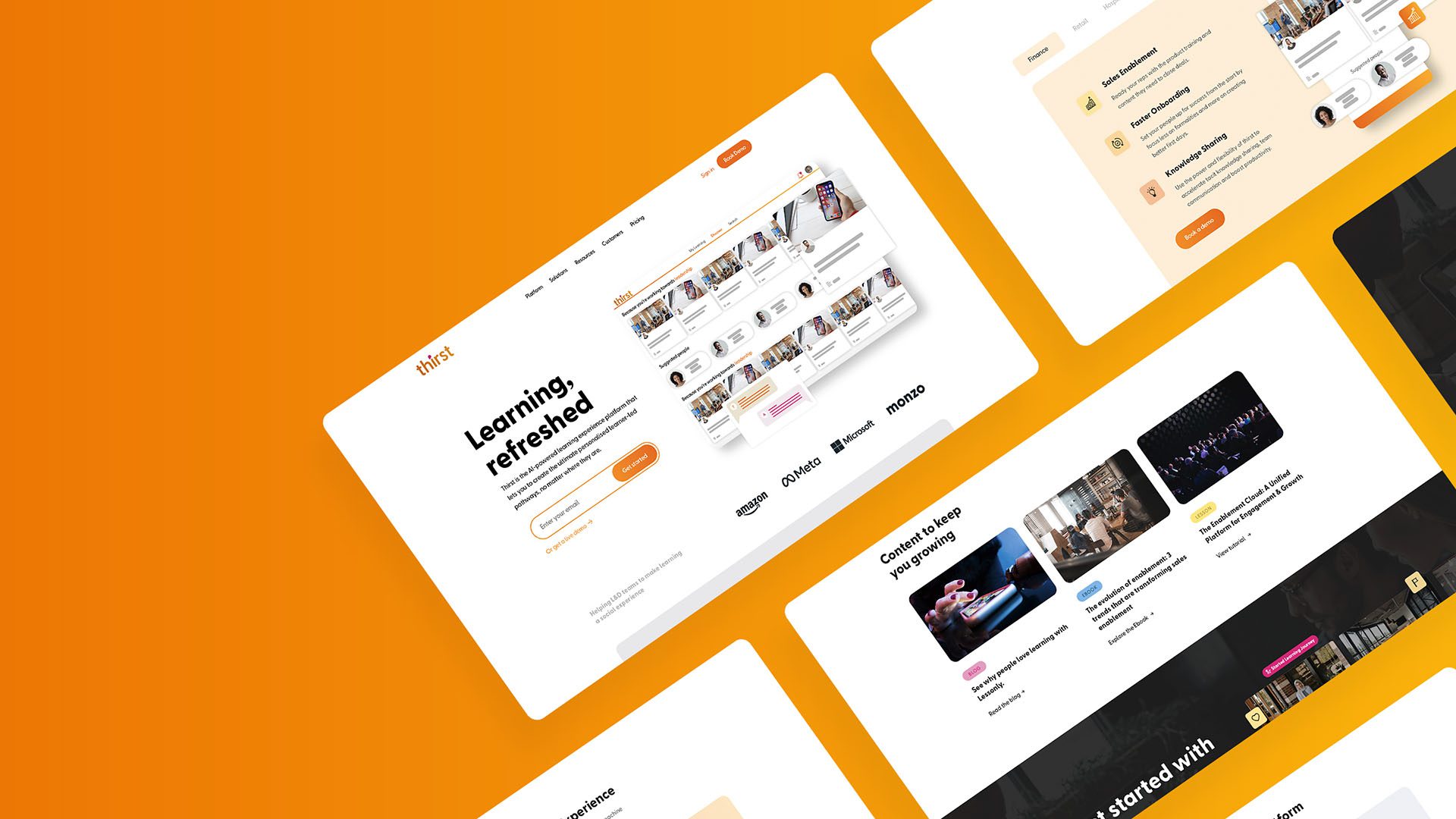
Through collaborative work with Thirst and plenty of research, we agreed on a style that incorporated animated graphics, video and white space. The initial Thirst brand style heavily relied on their primary colours for backgrounds, titles and even body copy. It all felt a bit too much. So we stripped it back and started from a black and white template with highlights of their primary colours. This minor tweak in the use of colour has really helped to elevate the brand and provide a clearer user experience.
We then took these styles and rolled them out into assets such as event stands, presentations, ebooks and social media content giving Thirst a consistent look and feel throughout.


Insight
There is a lot of competition in the learning platform world and seems to be a big gap between the leaders in the industry and the rest of the players. Our challenge was to make sure we stood out as an industry pioneer.
Many of the competitors seem to put a lot of effort into their websites but then are not consistent when it comes to their social presence. This was another angle where we could try to excel and stand out.
Idea
We didn’t want to be too radical in our thinking but we did want to stand out and deliver ideas and content that gives us the edge over the competitors. We analysed the other learning platform leaders and found that the use of animation, video and clean graphics was key to creating a successful digital brand. We made those elements our key focus to guarantee we would deliver a great website.
Impact
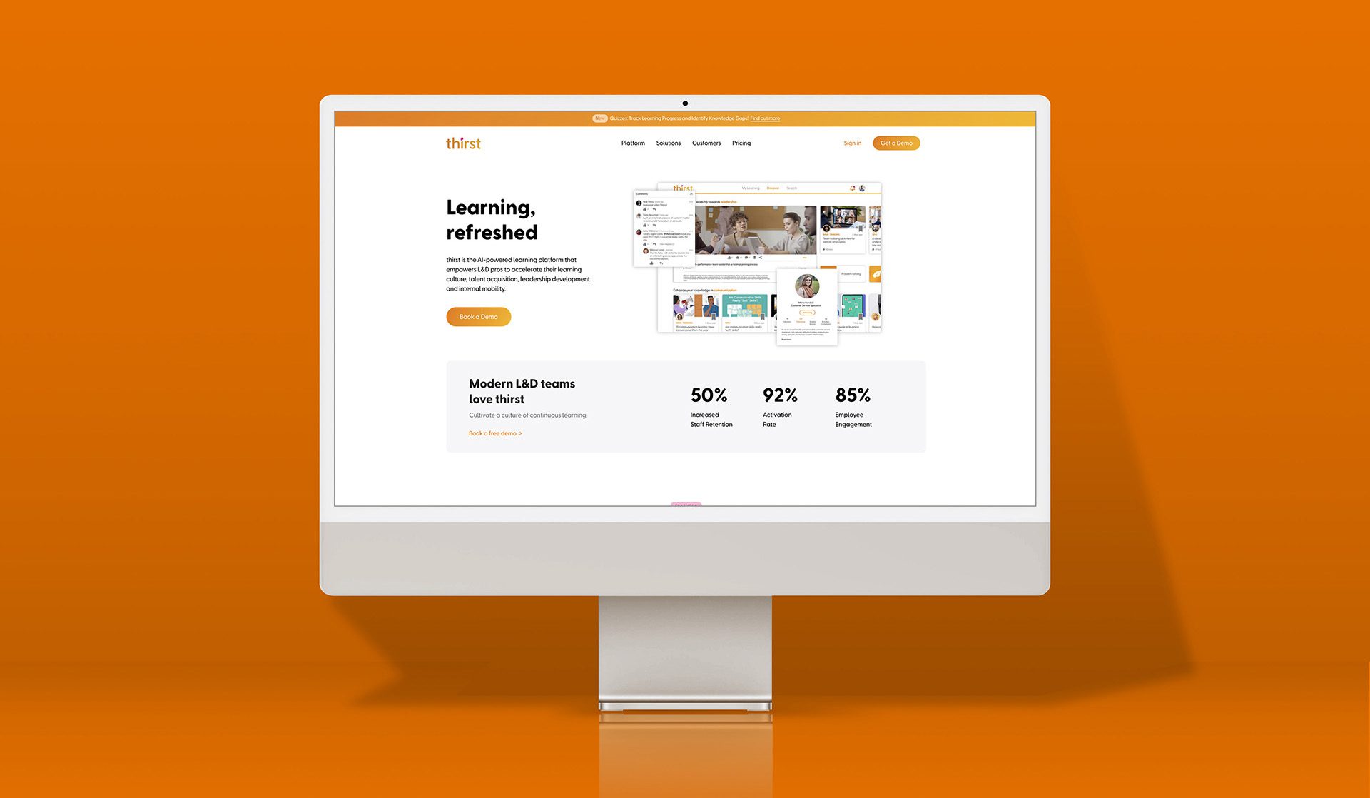
We developed a new visual identity, re-imagined the website experience, video styles and animation. The launch of the new website has been such a success that Thirst have since started to re-develop their platform styles to match the work we’ve produced.
Their social content is now more engaging and reflects the quality of their work much better. Their offline assets are on brand and help to elevate them in presentations, at events and at all other touch points with potential users and investors.


